
My Suggested GUI for the Pandora Gaming UMPC
With thanks to everyone who has helped me with advice on the GUI, Joppa, Sinbad, Chip, Rokdcasbah, and everyone else - as well as to the Tango library for their icons (which are free to anyone). Here is my concept of a GUI for the Pandora. Brief explanation to follow - but in-depth discussion was started here.
 Click for big.
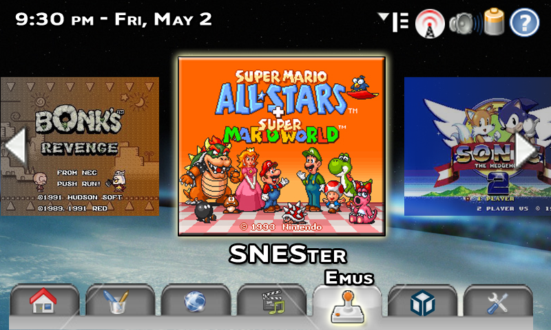
The Slider Mode of the Emu tab
 Click For big.
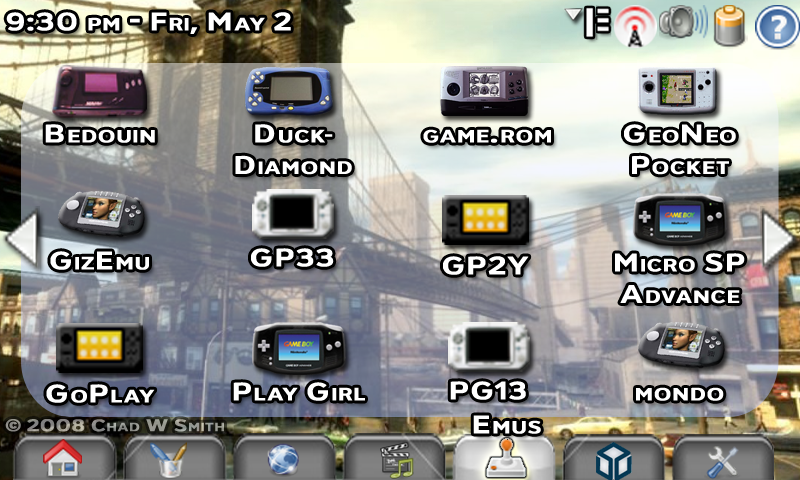
The Grid Mode of the Emu tab
 Click for big.
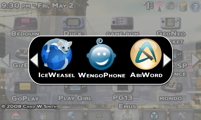
The "Alt+Tab" Shot / Active App Picker
 Click for big.
TABS, (from left to right):
Home (described below), Applications (OpenOffice.org, AbiWord, TuxPaint, PDF Viewer, ComicBook Reader, ImageViewer, Calculator, Calendar, etc.), Web (Firefox, Email Client, Chat, SIPPhone, Feed Reader, Contacts list), Media (Mplayer, VLC, Internet Radio, Podcasts, Voice Recorder), Emus, Pandora (Native Games - Native apps that don't fit anywhere else), Prefrences (Wallpaper, network settings, power save, control panel type stuff).
CONTROLS:
Shoulder buttons recycle among the tabs, which are on the bottom for easy tapping. All icons are tappable (touchscreen) or selectable through the D-pad and main face button (X, A, rhombus, whatever it is). Right and left on the D-pad scroll through icons on the Slider view, or among the icons in Gird mode. The extreme right and left center of the screen, when tapped, will move to the next screen in Grid, and the next icon in Slider. Analog stick scrolls through icons as well. Main button selects. Secondary button gives info about the selected icon. A keyboard shortcut can switch among selecting the icons in the main window - the fixed icons across the top (Options, WiFi, Volume, Battery, Help) - and the tabs. The Options menu is where users select from Slider, Grid, or List.
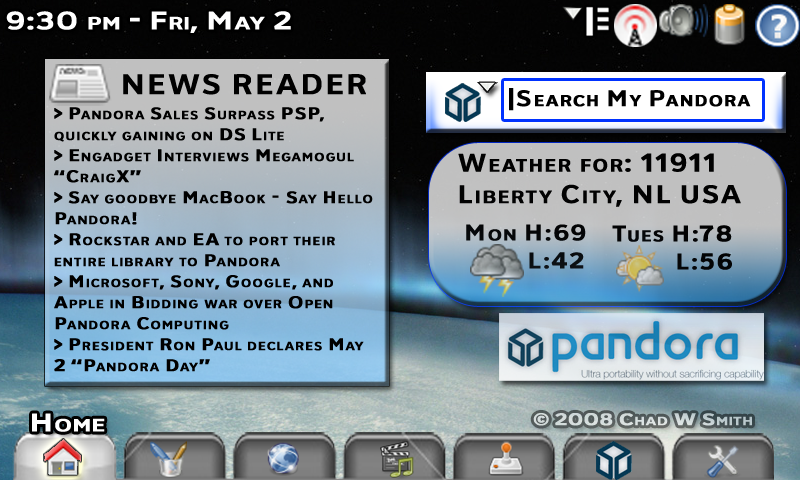
HOME TAB:
(Similar to the Home of the Nokia Maemo-powered N-Series Internet tablets, Apples Dashboard, iGoogle.com, etc.)
Widgets are user controlled. Using the touchscreen, they can resize and move the widgets on the screen. Widgets are selected and deselected using the options menu. Widgets could include News Feeds, Weather, Internet Radio, Media player, Search box, mini-games, (tictactoe, Sudoku, etc.), maps, contacts, chat, email, etc..
The boxes become solid when selected. (The Search box is selected in the picture.) This draws focus to the selected item. The Pandora Logo seen the bottom right would, if you click on it, take you to the Pandora homepage (assuming you are online) - http://www.openpandora.org/
The Search box has a drop down menu, just like the Firefox search box, hence the little down arrow. The current icon - the Pandora icon - searches your Pandora - the onboard storage, as well as any flash cards or USB drives that are attached, (assuming theyve been indexed). It would just be a name search - not a content search. So think Windows Search box from 98 - not Mac OS X Safari, or Google Desktop. You could select Google, Yahoo, Live, ThePirateBay, whatever search engines you install. But again, those only work while online - so it defaults to Pandora search, (maybe you can pick the default search).
The Weather automatically updates whenever you are online. I forgot to add the Currently info, but you get the idea. You type in the zip code (for US - postal code, city & country, etc - for other countries), and it tells you the weather.
The News Reader can be set to whatever RSS/Atom/Podcast feeds you want - again, automatically updates when online.
SLIDER MODE:
(Similar to the PSP firmware menu, and Apples CoverFlow)
On Slider, three icons are seen at a time, the selected icon is in the center. It is in full color, completely solid (100% opacity), drop shadowed, glowing, and larger than the other icons. Two other icons are visible on either side. They are 75% the size of the selected icon - the fade to greyscale as they approach the sides of the screen, and they are 75% opacity - no shadow or glow. *Note - the screenshot is representative of the last game played, or of a favorite game for that emulator. You're scrolling through emulators (systems) not individual roms (games). A couple dozen at most - not thousands. Perhaps screenshots should be replaced by shots of the systems, as pictured in the Grid mode shot.
GRID MODE:
(Similar to the traditional desktop of most user oriented operating systems)
A grid of icons that are spaced into two rows of 4 icons each, the name of the file underneath. Collected into pages that can be scrolled through by tapping the extreme sides of the center of the screen.
BTW - these are just mock-ups. so the icons used, like for the different systems, are not finished products. This is all just my suggestions (altered, of course, by people's feedback) in a visual form. I know the resolution / coloring sucks on some of the stuff. It's just a mock-up. If I were actually making the GUI things would be much better looking.
I want to add a mock-up of the List view, and maybe the options screen. Again, thanks to everyone for their comments, critiques, and suggestions!
1 comment:
don't forget to add a coverflow view :)
Post a Comment